Article contents:
Analytics
> Navigating to Analytics
Support at Home transition dashboard
> Examples
Analytics tiers
Analytics assignment permissions
Analytics tier assignment
Purchase oders and Membership plans
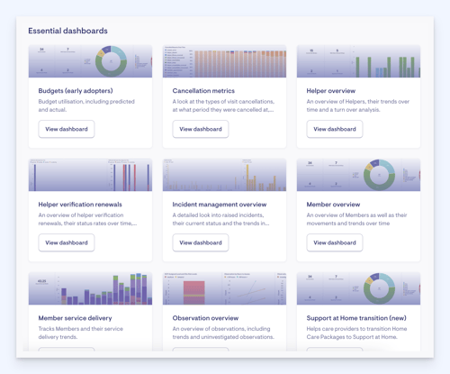
Analytics
We are giving you complimentary access to Lookout Analytics until 12 December 2025 to support your transition to Support at Home. This means you’ll have access to all Analytics dashboards across your organisation – including a dedicated Support at Home dashboard along with 8 other essential dashboards.
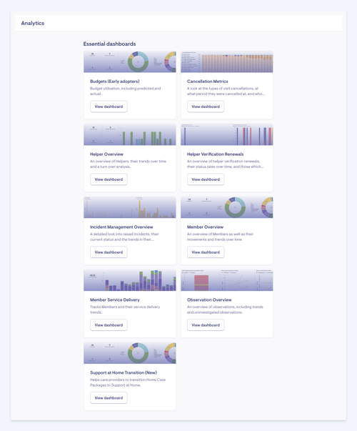
Explore your data effortlessly with Lookout Analytics' collection of intelligent dashboards. Each dashboard is designed to quickly answer your queries and present them in the most appropriate format for your team, whether a bar chart or a detailed table.
The dashboards provided by Lookout Analytics assist staff in making informed decisions that align with their role. These dashboards are tailored to specific areas, such as clients, workers, finance, revenue, and operations. You can also experiment with creating your own dashboards!
It is important to note that due to the amount of data and information being processed, these dashboards are all updated four times a day - 7 AM, 12 PM, 4 PM, and 8 PM AEST.
Navigating to Analytics
Navigate to the bottom of the main side menu, and then select Analytics.
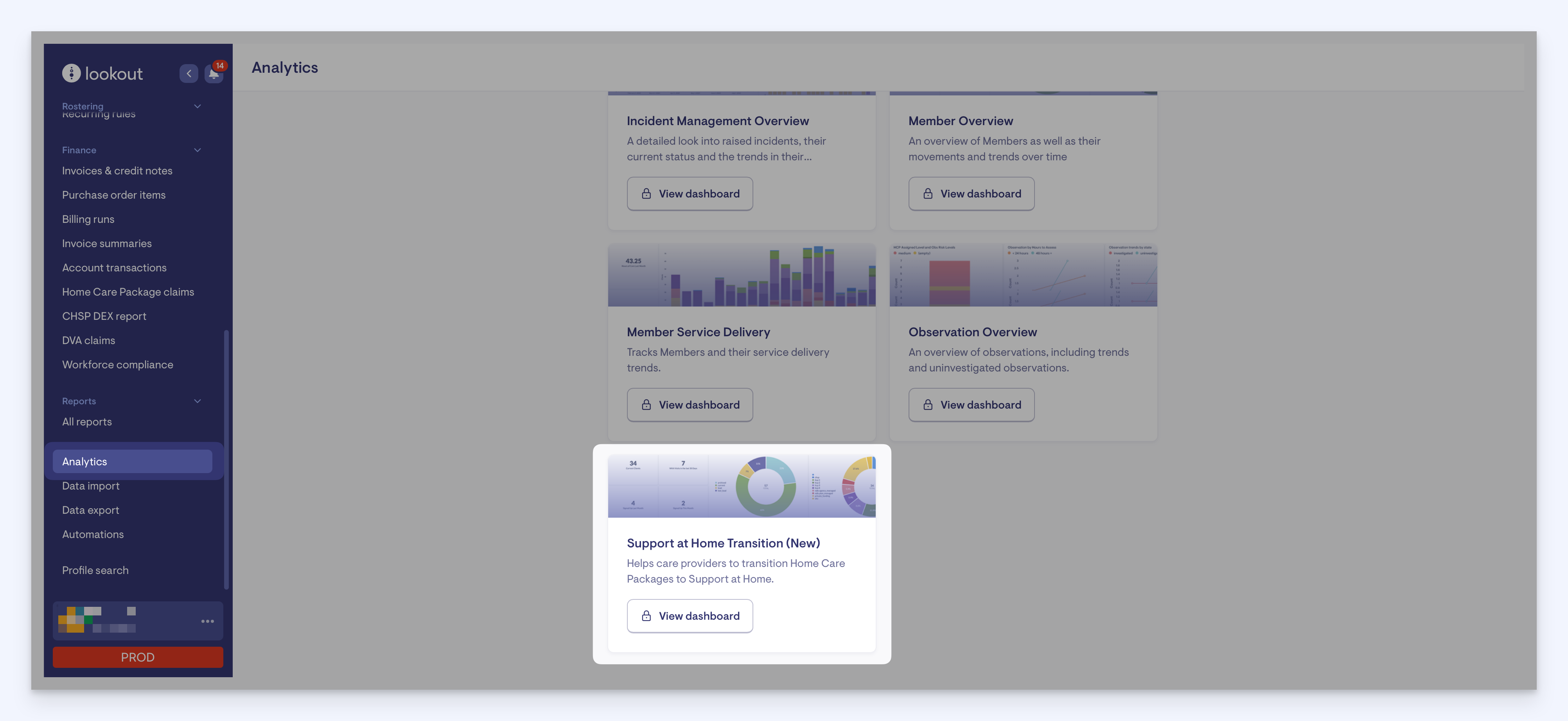
Click the View dashboard button for your Support at Home Transition analytics. You will have numerous boxes and stats presented to you on the next screen. We will look at the Support at Home dashboard in more detail now.
Support at Home transition dashboard
This new Support at Home dashboard gives you a clear view of the transition ahead, showing how many visits, purchase orders and memberships still need to be mapped.
When used with the new Support at Home bulk tooling, it breaks down what might seem like a large and complex task into smaller, manageable steps, making the transition easier to plan for.
It’s designed to:
-
Highlight the number of visits, purchase orders and membership plans that need to be migrated to Support at Home.
-
Help you plan and allocate the right amount of time for the migration
-
Let you monitor your migration, verify progress step by step, and stay on track to complete it confidently before November 1st
-
Be visible to both you and our support team, so we can provide help more effectively when needed.
Now lets take a closer look at the Support at Home dashboard and break down some of the information presented here. Along the top, you will see tabs for Rates, Purchase orders and Membership plans. Starting with the Rates tab, let’s break down the data you’re being shown here.
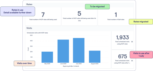
At the top of the Rates dashboard, as pictured in the image above, you'll find the current statistics related to HCP rate usage. Please note that the figures displayed in this example are from a demo environment, so actual production values may differ.
The key metrics displayed here are:
-
Rates Still in Use: The total number of HCP rates that are currently active in the system and still being used.
-
Rates to Be Migrated: The number of HCP rates that have not yet been transitioned and will still be being used after 1 November.
-
Rates Already Migrated: The number of rates successfully migrated to the new Support at Home rates.
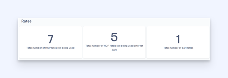
These numbers are crucial for tracking progress and prioritising migration tasks. Clicking on the numbers here will take you to the information sitting behind them, so for example clicking the 7 total number of HCP rates still being used in the example above will bring up these 7 rates so I can see what they are: 
Be sure to click the number and not the title in the square, as the title will not take you to the relevant information you are trying to see.
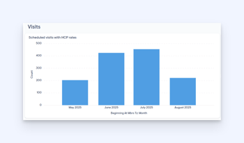
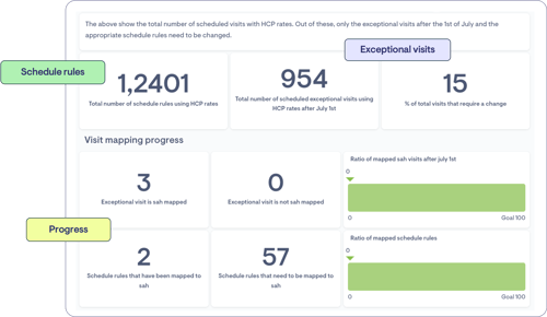
Below the key metrics, a graph displays scheduled visits related to HCP rates over time. The graph shows a monthly breakdown of visits that still involve the HCP rates and visual trends indicating where HCP rates are still in use across different months.
Ongoing use of HCP rates in earlier months is expected during the transition period, but all scheduled visits with HCP rates should be phased out before 1 November. Your graph should show a decline in scheduled visits as you transition to Support at Home rates.
Adjacent to the graph, a callout box highlights critical visit usage data. The total scheduled visits using HCP rates number tells us how many visits still use these rates. The box below shows how many of these HCP rates are still in use after 1 November. These are key figures to monitor and reduce to 0 by 1 November.
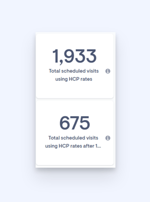
The above show the total number of scheduled visits with HCP rates. Out of these, only the exceptional visits after the 1st of November and the appropriate schedule rules need to be changed.
Let's look at the bottom half of the dashboard now.
Again, please note that the figures displayed in this example are from a demo environment, so actual production values may differ. The key figures displayed here are:
Total Schedule Rules: The overall number of scheduling rules in the system using HCP rates.
Exceptional Visits After November 1: Identifies the total number of visits using HCP rates still scheduled past the cut-off date.
Percentage of visits requiring a change: The actual percentage of visits that actually require a change to Support at Home.
These allow you to understand the broader picture, while breaking it down into digestible numbers for easier action. We want you to feel confident and understand fully the numbers presented to you in your dashboard.
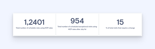
Underneath, you'll find the Visit mapping process section, which shows the status of mapping exceptional visits and schedule rules. In the example, you will see that two schedule rules have been mapped and 57 that are still required to be. Breaking the information down here in this way will hopefully help you to see through numbers what is left to re-map visually and you can work on getting these down to 0.
The first two boxes show the total number of HCP rates being used and the total numer of HCP rates still being used after 1st November. The goal is by using our new re-mapping features, to help you get these numbers down to 0 by 1st November.
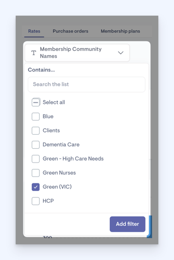
Taking on board recent feedback, this screen has some slight changes since the May 20th launch. You now have the functionality to filter by community. Click the Membership Community Names drop down, and here you can filter your analytics to a specific Community name. Doing so will then update the details based on the community information. Selecting a Community Name and applying will also filter the information shown on the Purchase order and Membership plans tab while applied.
The Community filter only works with data that’s connected to a community. Here's how it applies in different sections:
-
Rates Tab: Rates aren’t linked to a community, but visits are. So in this tab, the community filter only affects the visit charts.
-
POs Tab: The filter works on all charts in this tab, since they all relate to a community.
-
Membership Plans Tab: The filter applies to any chart that’s connected to a membership. However, a standalone membership plan isn’t tied to a community won’t be filterable.
This dashboard can only update every two hours due to the volume of data that it needs to process. This means that when re-mapping, it might not immediately reflect in your Analytics dashboard information. We have added a most recent data refresh timestamp to help you quickly understand how relevant the analytics information you’re viewing is. This will show you the last time the analytics data was refreshed in your company's time zone.

The dashboard will continue to evolve as:
-
more Support at Home functionality is realised
-
We continue to review the content
-
We receive feedback from you
Examples
Let’s look at an example:
Here we can see a breakdown of all the HCP rates a company currently has and the types of services they belong to.
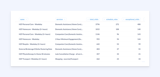
There are 8,477 visits which need to be mapped to a Support at Home service. 715 of those are schedule rules and 1,015 are exceptional. Therefore, only 20% of the total number of visits need to be mapped to achieve full Support at Home coverage.
This approach means that not all visits must be mapped to complete the migration process. Only the schedule rules and exceptional visits need to be mapped to reach 100%.
By focusing on mapping the schedule rules and exceptional visits, the migration for visits is complete.
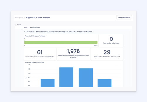
The transition dashboard also allows you to view your mapping progress. In the example below, 61 scheduled rules and 1,978 exceptional visits require mapping to Support at Home rates.
The goal is to reduce these numbers to zero by utilising the Support at Home bulk mapping tools and monitoring the percent of HCP rates vs SaH rates move towards 100.
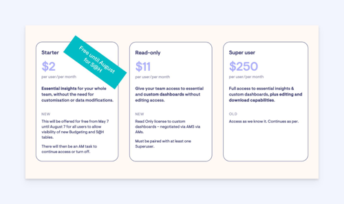
Analytics tiers
We’re introducing a new Starter Tier in our analytics, providing staff with access to essential dashboards such as budgets, incidents, and cancellation metrics. This new tier lowers the access barrier, ensuring staff can easily access critical data to make informed decisions in managing a care business.
At the core of every successful care business is the ability to make informed decisions, and data plays a critical role in that. With the Analytics Starter Tier, we aim to lower the barrier for staff access, making it easier for everyone to get the data they need to help the business thrive.
The Starter tier is ideal for team members who need to track essential business data without the need for advanced customisation or dashboard creation. It ensures that critical data is accessible without the complexity of advanced features, giving essential insights for your whole team, without the need for customisation or data modifications.
This new Starter tier will be offered for free from May 7th until December 12th for all users to allow visibility of new budgeting and Support at Home tables. We continue to offer the read-only and super user tiers, which provide additional features for users who need to create, customise, and share their own dashboards.
Analytics assignment permissions
The ability to assign staff to an analytics tier can only be completed by someone with the correct permissions. You will either need to edit an existing access role to include this permission or create a new one and assign it to relevant staff.
For staff to have access to these analytics, we must complete a few steps:
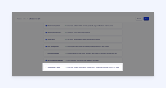
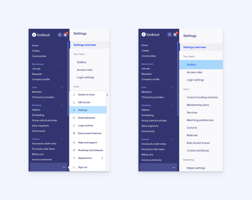
Navigate to Settings by clicking the three dots next to your name in the navigation bar, and then select Access roles under the Your team heading.
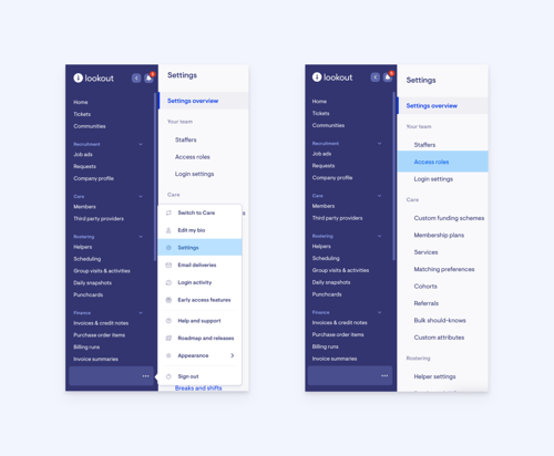
Tick the Subscription & billing box to give permissions to assign analytics tiers to other staff.
By introducing the starter role and building the essentials dashboards we’re lowering the barrier so that all staff can access this critical data they work with daily. We believe everybody in care should have the insights needed to make informed decisions – this initiative reflects that.
Analytics tier assignment
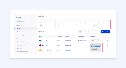
Navigate to Settings by clicking the three dots next to your name in the navigation bar, and then select Staffers under the Your team heading.
You will see your total staffers listed. Looking along the filter columns, you will see one for Analytics. Here, it will say if your staff member is already assigned a tier, or say none, if no tier has yet been assigned. Using the drop-down, you can assign a tier to the selected staffer. This then grants them access to the analytics level you have selected for them.
Purchase orders and Membership plans
In addition to the Rates dashboard, two other essential tabs are available in the interface – Purchase orders and Membership plans. These tabs provide supplementary data critical to the migration and planning process. While both will be covered in greater detail in other articles, this section offers a brief overview to help you explore and understand the information available now.
The Purchase Orders tab provides a detailed view of all purchase orders, with a focus on those relevant after 1 November. This tab is essential for tracking compliance with new service structures and understanding financial commitments going forward.
There’s two main sections to the Purchase orders tab. Which one you use depends on the filtering and detail that you require.
The first section is a targeted, or more constrained, list that shows open purchase orders, that are assigned to current HCP memberships, and which an estimated delivery date exists after the 1st November 2025.
The second section is a broader list and aims to be more comprehensive. It contains both open and closed purchase orders, assigned to current HCP memberships, and has services that have a potential to be delivered after the 1st November 2025. This means that it contains purchase orders with an estimated, or actual, delivery date after 1st November 2025, and also contains purchase orders that have no date assigned to it.
Both sections aim to convey the same information:
-
Service Attachments: Information on services and service rates linked to each purchase order.
-
Clarity on Services & Rates: This view brings transparency to what services are linked to each PO, helping you ensure alignment with the new structure.
-
Linked Tickets: Each purchase order is associated with ticket links, allowing you to easily view detailed records or take action as needed.
Purchase orders will be discussed in further detail in an upcoming article.
The Membership Plans tab presents live data on existing plans and their configurations, giving you a clear view of your current Membership plans, and those is use. You will find current, real-time information about the size and structure of membership plans, as well as a preliminary planning view. This allows you to start evaluating which plans may need adjustments to align with post-migration expectations.
Membership plans are covered in more detail within the following article: Support at Home Membership Plans.